CLIENT PROJECT
THE
COOKBOOK
PROJECT
Creative Direction • Brand Strategy • Voice and Messaging •
Identity & Logo • Copywriting • Illustration
::
making
Food Literacy
vibrant & accessible
THE STORY
The Cookbook Project, a health non-profit organization with a special challenge of making the message of Food Literacy appeal to a wider audience, wanted to pursue a bolder shift in an effort to revitalize the look and feel of their brand.
a meaningful
makeover
The message of TCBP is an especially inspiring one: introducing “Food Literacy” to low-income and overlooked communities where lack of food education can have a life-altering negative impact on health. One of their largest audiences is young, elementary school children who get a hands-on education in food nutrition while also growing their own food gardens.
Another important audience is the Food Educators who run the programs, as well as volunteers with a strong sense of community activism. The previous identity was whimsical and cute, but lacked versatility and failed to convey any real brand spirit. It was important that the identity would also help in fundraising efforts so crucial to maintaining operations.
The redesign overcame these obstacles, recentering its core and injecting a more vibrant heart and spirit into the brand. By shifting perspectives and making the message more clear and engaging, TCBP aims to inspire enthusiasm and connection from youthful participants, adult educators, and new members drawn to a special community of Food Warriors.
redesigned
brand mark
the modernized mark
enhances versatility.
THE COOKBOOK PROJECT
values &
typography
Defining The
Visual Language
The message of TCBP is one of warmth, positivity, and compassion. Aside from tackling educational and information needs, it was essential to define a core central idea that would invite participants from all walks of life to want to enter the TCBP “world”. That idea revolved around the concept of food being the essence of life and that strengthening our relationship to food could foster better communities.
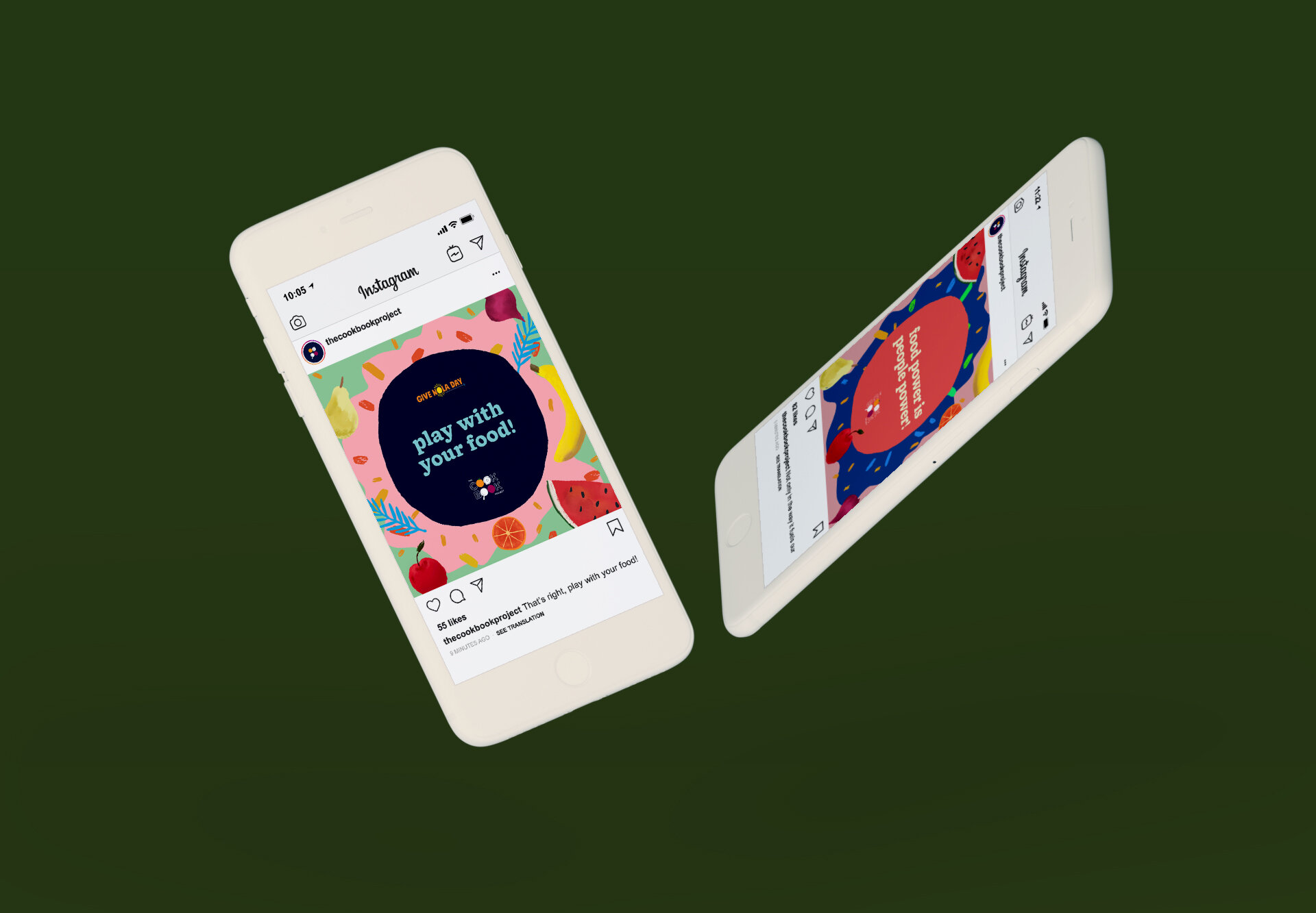
The casual, inviting, free-spirited expression of the brand design stemmed from this central idea of wanting participants, volunteers, and educators to feel aligned to a deeper purpose without feeling intimidated or talked down to. The core idea also informed everything from the typefaces to the colors and the intentionally “handmade imperfection” of the graphics, to the official tagline, messaging, and tone. The new visual language hopes to be a clarion call bringing passionate and committed people together for a great cause.


