CLIENT PROJECT
GASTRONOMY
UNDERGROUND
Creative Direction • Branding/Identity • Strategy
Messaging • Logo Redesign • Illustration
::
modern spirit,
ancestral roots
THE STORY
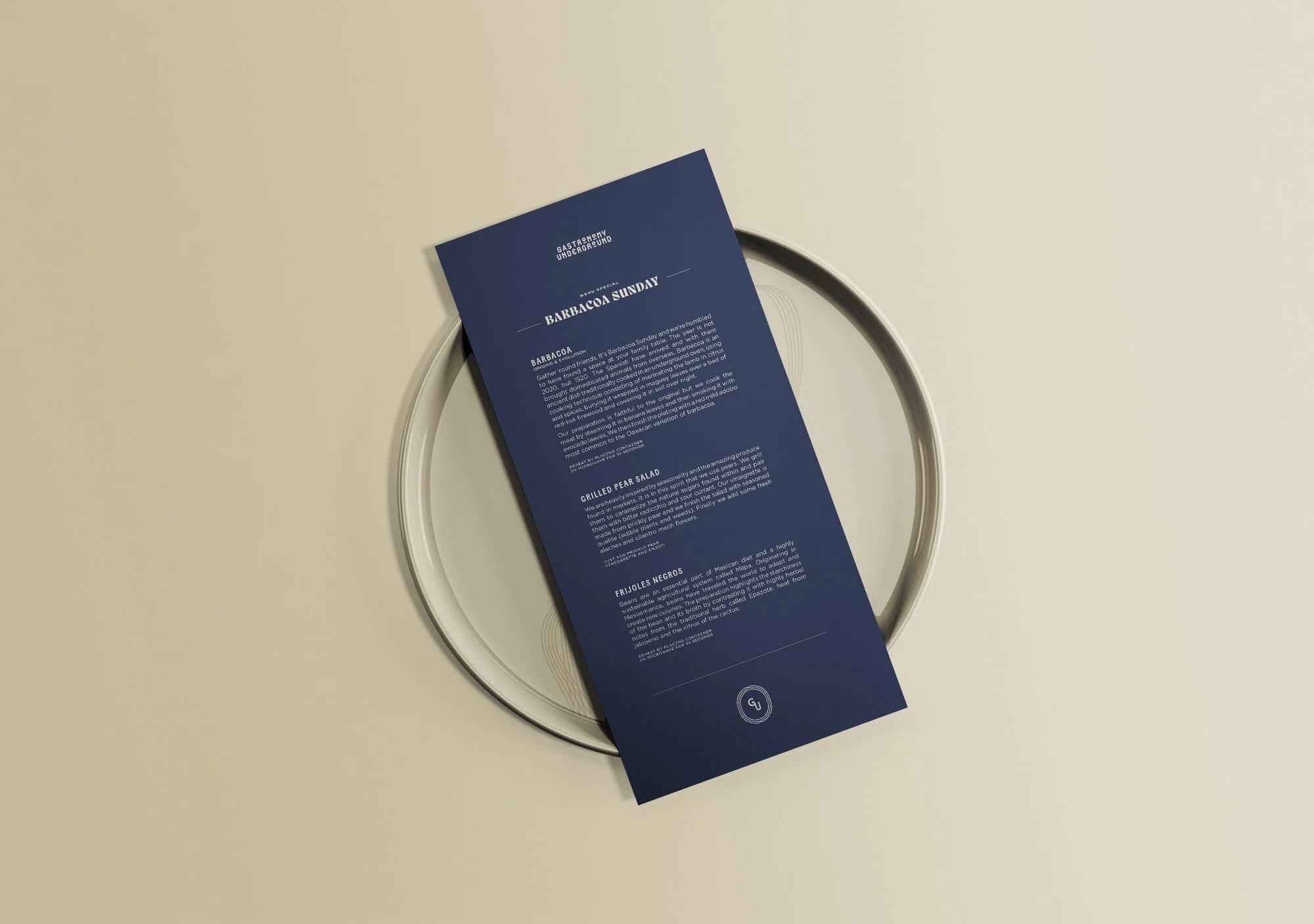
Formed during the global pandemic of 2020, Gastronomy Underground (GU)—initially conceived as an “underground dinner party”—was reborn as a high-quality, online meal kit service with a curated menu for adventurous Brooklyn foodies.
Two central considerations (innovative food culture and the exploration of ancestral heritage) drove the design direction of the brand. ParticleMade worked closely with GU to discover their essence, express their adventurous outlook, and offer non-traditional ways of connecting with their ideal customers.
THE RESULT
In less than a year, the brand design took GU from an unknown newcomer to a beloved brand with loyal customers across Brooklyn and Manhattan. Gastronomy Underground was featured in The New Yorker magazine, Grub Street, Vice Media, partnered with Monte Xanic wine, and the James Beard Foundation. They experienced a surge in demand where they catered private events for Manhattan’s power circles. Their growth that allowed them to rebrand as a fast casual brick physical location in Chelsea called PLOO in 2022 (case study coming soon).
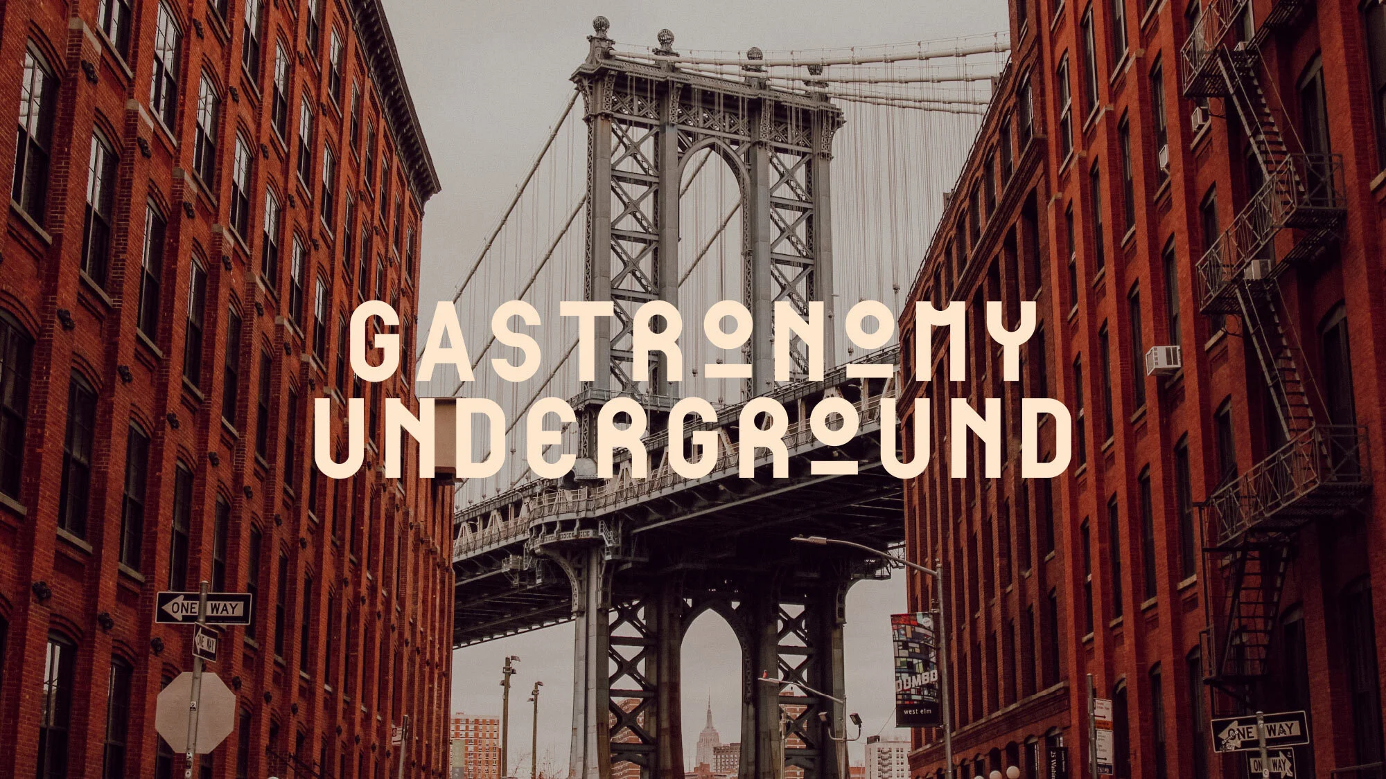
top photograph:
Tonje Thilesen
from The New Yorker magazine article
Mexican Cuisine Filtered
Through An NYC Experience
Although GU’s founders were trained in NYC’s Michelin-star restaurants, it remained crucial for the brand to convey an inviting approachability and avoid perceptions of elitism. The challenge was in capturing the eclectic heritage of Mexico and its rich cuisine but also staying true to the innovation vital to GU’s food philosophy. This is the ongoing conversation that defines the spirit of the GU brand.
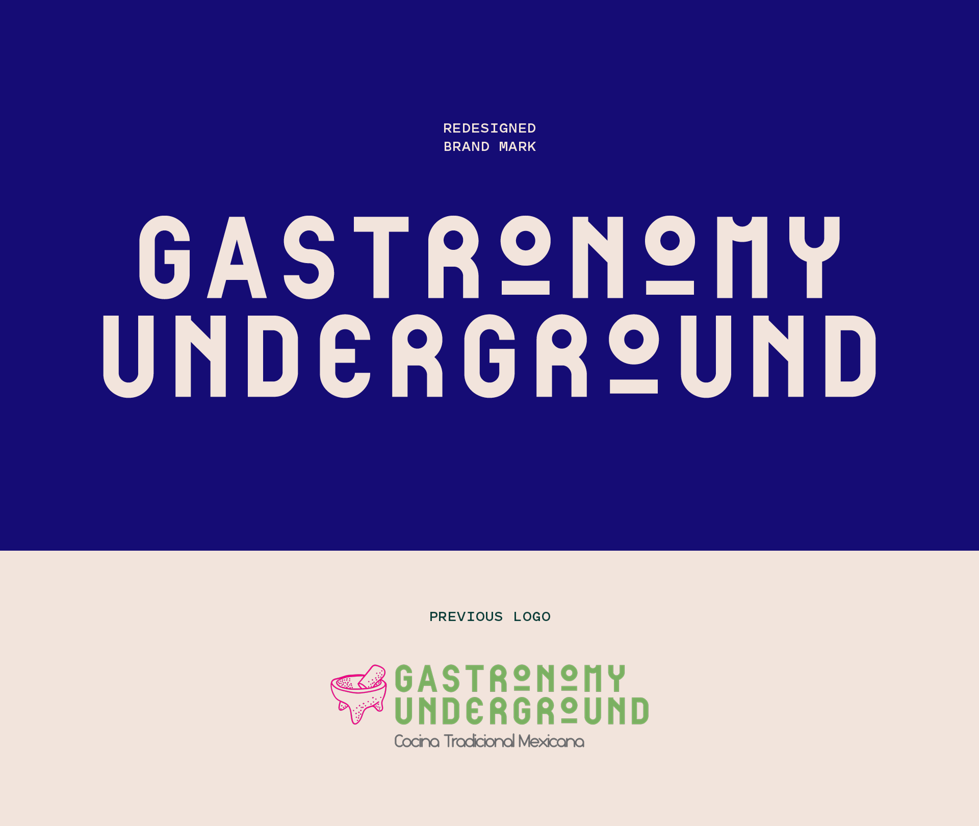
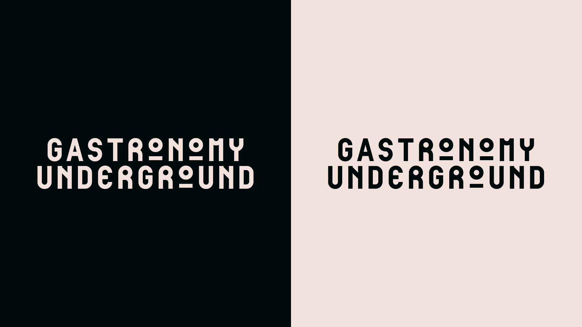
Primary Wordmark
Primary Icon
A New
Monogram
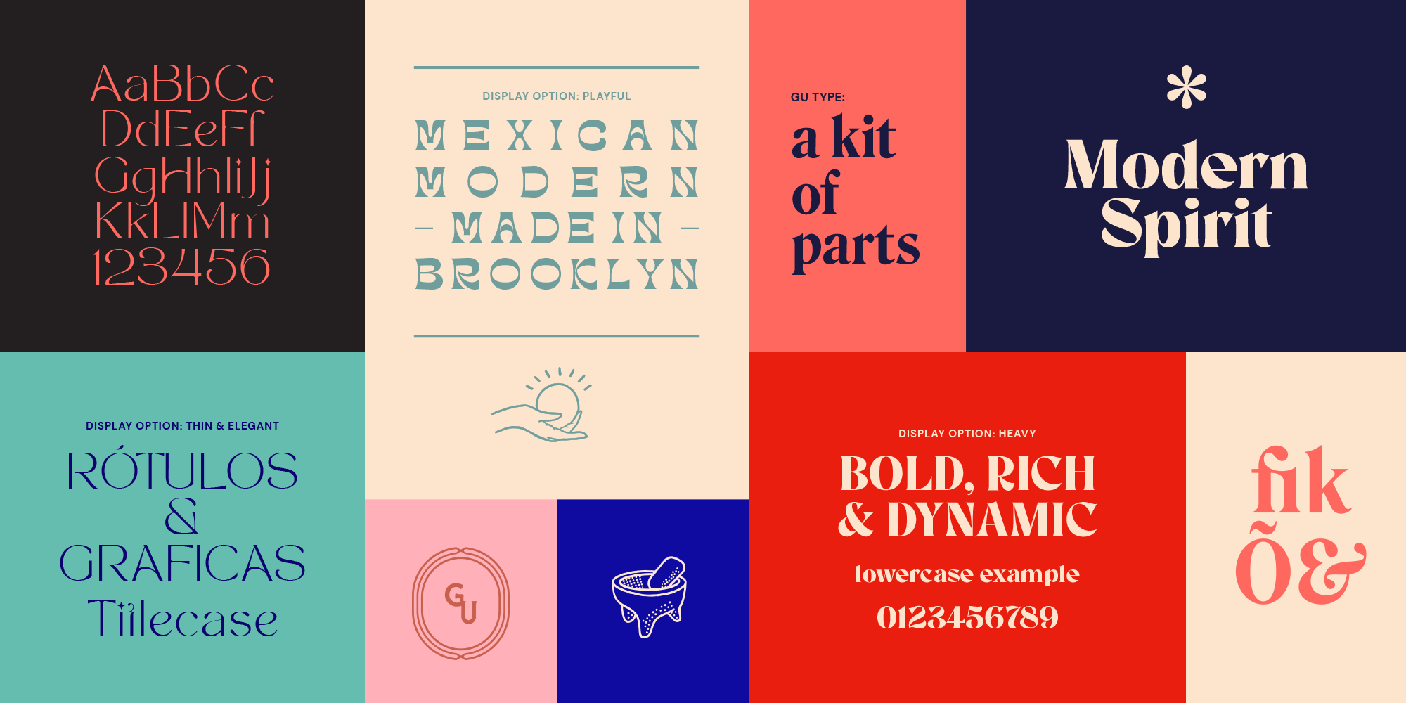
Paying homage to the embroidered monograms on the chef coats of their restaurant kitchen past, this new icon represents the polish of culinary excellence juxtaposed with the handmade craft of cooking. It may be used when the primary wordmark alone may not be optimal or in concert with the wordmark itself.
ORIGINS OF THE TAGLINE
Modern Spirit,
Ancestral Roots
Understanding how the brand wished to be seen and who they wanted to attract, it became obvious that they weren’t in competition with casual fast-food brands like Dos Toros or Chipotle, nor high-end establishments offering Mexican cuisine at fine-dining prices. They existed somewhere in between.
More importantly, their driving force was a fusion of their modern outlook while exploring the ancient traditions and mythology of Mexican food itself. After several iterations, the core of GU’s essence was captured in the tagline I created, “Modern Spirit, Ancestral Roots”.
FOOD AS COMFORT,
FOOD AS INDULGENCE,
FOOD AS EXPRESSION
